أساسيات معايرة الشاشة The Basics of Monitor Calibration

تقليص
X
 
  • تصفية - فلترة
  • الوقت
  • عرض
إلغاء تحديد الكل
مشاركات جديدة

  • أساسيات معايرة الشاشة The Basics of Monitor Calibration

    أساسيات معايرة الشاشة
    The Basics of Monitor Calibration
    The subject of monitor calibration and profiling can be quite difficult to understand not only for a beginner, but also for professionals working in the field. With so many different hardware and software components, color profiles, bit depth and other related terminologies, one can get quickly confused and lost, potentially ending up with a rather poor working environment. Having a badly-calibrated monitor is not only counter-productive, it is also potentially harmful for one’s business, especially when dealing with paying customers and clients. Due to the complexity of the topic, our team at Photography Life requested help from a real expert, who will be providing detailed information on how to properly calibrate monitors for photography needs. But first, some basic concepts need to be understood. This particular article is just an introduction to cover the basics of calibration and profiling, without going into too many technical details.

    قد يكون من الصعب جدًا فهم موضوع معايرة الشاشة وتوصيفها، ليس فقط للمبتدئين، ولكن أيضًا للمحترفين العاملين في هذا المجال. مع وجود العديد من مكونات الأجهزة والبرامج المختلفة، وملفات تعريف الألوان، وعمق البت والمصطلحات الأخرى ذات الصلة، يمكن للمرء أن يرتبك ويضيع بسرعة، ومن المحتمل أن ينتهي الأمر ببيئة عمل سيئة إلى حد ما. إن وجود شاشة تمت معايرتها بشكل سيئ لا يؤدي إلى نتائج عكسية فحسب، بل قد يكون أيضًا ضارًا بأعمالك، خاصة عند التعامل مع العملاء الذين يدفعون. نظرًا لتعقيد الموضوع، طلب فريقنا في Photography Life المساعدة من خبير حقيقي، والذي سيقدم معلومات مفصلة حول كيفية معايرة الشاشات بشكل صحيح لاحتياجات التصوير الفوتوغرافي. لكن أولاً، يجب فهم بعض المفاهيم الأساسية. هذه المقالة بالذات هي مجرد مقدمة لتغطية أساسيات المعايرة والتنميط، دون الخوض في الكثير من التفاصيل الفنية.

  • #2
    Table of Contentsجدول المحتويات

    تاريخ موجز للغاية إدارة الألوان وإحداثيات الألوان مسافة اللون ملفات تعريف درجة الحرارة المرتبطة بالألوان نوايا العرض المعايرة معايرة LUT ثلاثية الأبعاد التوحيد أجهزة القياس مقاييس الألوان مقاييس الطيف الضوئي

    تعليق


    • #3

      1) A Very Brief History


      As you might already know, monitors, TVs, mobile devices, etc., can show us colors using a mixture or Red, Green and Blue (RGB) light. Common monitors try to cover a minimum standard color space known as “sRGB” with their red, green and blue emitted light. The Internet and most computer content is meant for this particular color space. For historical reasons, sRGB and other similar color spaces like Rec.709 cover the same gamut (subset of visible colors) as CRT monitors. This color space is not able to cover colors printable with current technology like offset printing or a domestic inkjet printer – there are colors like cyan-turquoise green that are printable with such devices, but cannot be shown on an sRGB monitor. That’s the main reason that leads professionals and photo hobbyists into seeking monitors with a wider gamut which covers a large percentage of color spaces like AdobeRGB 1998 or eciRGBv2.
      1) تاريخ موجز جدًا

      كما تعلم بالفعل، يمكن للشاشات وأجهزة التلفزيون والأجهزة المحمولة وما إلى ذلك أن تعرض لنا الألوان باستخدام مزيج أو الضوء الأحمر والأخضر والأزرق (RGB). تحاول الشاشات الشائعة تغطية الحد الأدنى من مساحة الألوان القياسية المعروفة باسم "sRGB" بضوءها المنبعث باللون الأحمر والأخضر والأزرق. الإنترنت ومعظم محتويات الكمبيوتر مخصصة لمساحة الألوان المحددة هذه. لأسباب تاريخية، يغطي sRGB ومساحات الألوان المشابهة الأخرى مثل Rec.709 نفس النطاق (مجموعة فرعية من الألوان المرئية) مثل شاشات CRT. مساحة اللون هذه غير قادرة على تغطية الألوان القابلة للطباعة باستخدام التكنولوجيا الحالية مثل طباعة الأوفست أو طابعة نفث الحبر المحلية - هناك ألوان مثل اللون الأخضر السماوي الفيروزي قابلة للطباعة باستخدام مثل هذه الأجهزة، ولكن لا يمكن عرضها على شاشة sRGB. وهذا هو السبب الرئيسي الذي يدفع المحترفين وهواة التصوير إلى البحث عن شاشات ذات نطاق أوسع يغطي نسبة كبيرة من مساحات الألوان مثل AdobeRGB 1998 أو eciRGBv2.

      تعليق


      • #4

        2) Color Management and Color Coordinates


        The first thing photographers need to know is that their wide-gamut monitors are meant to be used in color-managed applications: applications that work in a color managed environment. For example, you have an sRGB 300×300 JPEG image that is just a green background (RGB values “0,255,0” in sRGB). With a common monitor (sRGB monitor) you can output its contents to the monitor directly, without conversions or color management, and you will see the green color that is “fairly close” to color information stored in that JPEG file. But if you do the same thing in a wide-gamut monitor configured to show its full gamut, that “0,255,0” RGB value will show native gamut green 255 and it will look over-saturated. This is where color management comes into play: if applications know the actual gamut of that monitor, they can translate this “0,255,0” sRGB value to another set of RGB values that represent the same color (or fairly close) in a bigger color space:

        sRGB 0,255,0 (green) -> 144,255,60 AdobeRGB (same sRGB green color)

        Such number transformations are possible, because colors (visible colors seen by humans) can be defined objectively as coordinates in a color space that covers human vision, like the CIE 1931 color space. There are several coordinate choices that map to color spaces like CIE 1931 XYZ (or just CIE XYZ onwards), which is a 3D coordinate system for visible colors with X, Y and Z coordinates.
        Measuring color in CIE 1931 XYZ coordinates (the most used color coordinate system for measuring) is about weighting the spectral power distribution (SPD, distribution of how much light is coming to measurement device for each visible wavelength) against a “model” of human vision called CIE 1931 2º standard observer (or just “standard observer” to keep it short). Wikipedia has a very good definition of CIE XYZ and where X, Y & Z coordinate values come from.

        Like our world, a city is a 3D space: north-south, west-east, but also an up-down location of a building. A city may be a 3D space, but we find it useful to represent a city in a 2D plane, like a paper map with north-south, west-east locations. A similar approach is CIE xyY color space, derived from CIE XYZ. In that CIE xyY color space, XYZ values (3D coordinates) are normalized to lowercase x,y,z values with the condition x+y+z=1, a scale conversion. Since a Y coordinate (capital Y) is kept in CIE xyY (it’s a 3D coordinate system after-all), original XYZ values can be restored. CIE xy coordinates (without capital Y) represent a 2D plot of CIE 1931 XYZ color space, like a city map… and like in a 2D city map some information is discarded, but we get a picture of locations quickly. The concept of this CIE xy 2D plot (or other 2D plot of a 3D color space) is important for the next articles. There are other common 2D projections of other 3D color coordinate systems like CIE u’v’.

        Another color coordinate system derived from CIE XYZ is CIE L*a*b*. It has 3 coordinates (3D color space), L* for luminance, a* for a green-magenta axis and b* for blue-yellow axis. It takes a reference CIE XYZ white for its definition so L*=100, a*=b*=0 are the coordinates of reference white.

        Since a 3D coordinate system for color does not carry information about actual SPD of the source, two light sources with different SPD may have the same coordinates, their SPD weighted against standard observer gives the same numbers. We see them with the same color. That’s called a metameric pair. That’s why we can capture colors in cameras and view them with colors close enough on a computer screen: different SPDs may have the same color coordinates.

        Two pieces of paper or fabric may have the same color coordinates under some lighting conditions. That means SPDs of the reflected light weighted against standard observer are equal or close enough, but if we change the SPD light source, then reflected light SPD changes too, so color coordinates of each sample may drift away. That mismatch is called illuminant metameric failure: for one light source there is a color match but for the other there isn’t.

        It may be possible that a human subject visual system has a different enough response from standard observer response. In that case, actual color coordinates (colors) “seen” by each observer will be different. This is called observer metameric failure. Human visual system response varies between subjects and with age, but a very huge percent of them are close enough to standard observer response: that means standard observer is a very good model. There is a limitation though: very narrow spikes in SPD from a light source (like a laser) will make those tiny differences between you and standard observer noticeable, but this is not a real issue for current WLED (sRGB) or GB-LED (wide-gamut) technology used in monitors, so don’t worry about it.

        There are other metameric failure sources, but please note that metameric failures and metameric pairs are defined over pairs: two samples, two observers, two light sources…

        تعليق


        • #5
          2) إدارة الألوان وإحداثيات الألوان


          أول شيء يحتاج المصورون إلى معرفته هو أن شاشاتهم ذات النطاق الواسع مخصصة للاستخدام في التطبيقات المُدارة بالألوان: التطبيقات التي تعمل في بيئة مُدارة بالألوان. على سبيل المثال، لديك صورة sRGB 300×300 JPEG وهي مجرد خلفية خضراء (قيم RGB "0,255,0" في sRGB). باستخدام شاشة مشتركة (شاشة sRGB) يمكنك إخراج محتوياتها إلى الشاشة مباشرة، بدون تحويلات أو إدارة الألوان، وسوف ترى اللون الأخضر "قريبًا إلى حد ما" من معلومات الألوان المخزنة في ملف JPEG هذا. ولكن إذا فعلت الشيء نفسه في شاشة ذات نطاق واسع تم تكوينها لإظهار نطاقها الكامل، فإن قيمة RGB "0,255,0" ستظهر نطاقًا أصليًا باللون الأخضر 255 وستبدو مشبعة بشكل مفرط. هذا هو المكان الذي تلعب فيه إدارة الألوان: إذا كانت التطبيقات تعرف النطاق الفعلي لتلك الشاشة، فيمكنها ترجمة قيمة sRGB "0,255,0" هذه إلى مجموعة أخرى من قيم RGB التي تمثل نفس اللون (أو قريبة إلى حد ما) بلون أكبر فضاء:

          sRGB 0,255,0 (أخضر) -> 144,255,60 AdobeRGB (نفس اللون الأخضر sRGB)

          مثل هذه التحولات الرقمية ممكنة، لأن الألوان (الألوان المرئية التي يراها البشر) يمكن تعريفها بشكل موضوعي على أنها إحداثيات في مساحة اللون التي تغطي الرؤية البشرية، مثل مساحة الألوان CIE 1931. هناك العديد من اختيارات الإحداثيات التي يتم تعيينها لمساحات الألوان مثل CIE 1931 XYZ (أو فقط CIE XYZ وما بعده)، وهو نظام إحداثي ثلاثي الأبعاد للألوان المرئية بإحداثيات X وY وZ.
          قياس اللون بإحداثيات CIE 1931 XYZ (نظام إحداثيات الألوان الأكثر استخدامًا للقياس) يدور حول وزن توزيع الطاقة الطيفية (SPD، توزيع مقدار الضوء الذي يصل إلى جهاز القياس لكل طول موجي مرئي) مقابل "نموذج" للرؤية البشرية يسمى CIE 1931 2° المراقب القياسي (أو مجرد "المراقب القياسي" لإبقائه قصيرًا). تحتوي ويكيبيديا على تعريف جيد جدًا لـ CIE XYZ ومن أين تأتي قيم إحداثيات X وY وZ.

          المدينة، مثل عالمنا، عبارة عن مساحة ثلاثية الأبعاد: من الشمال إلى الجنوب، ومن الغرب إلى الشرق، ولكنها أيضًا موقع من الأعلى إلى الأسفل للمبنى. قد تكون المدينة مساحة ثلاثية الأبعاد، ولكننا نجد أنه من المفيد تمثيل المدينة في مستوى ثنائي الأبعاد، مثل خريطة ورقية مع مواقع من الشمال إلى الجنوب والغرب والشرق. نهج مماثل هو مساحة اللون CIE xyY، المستمدة من CIE XYZ. في مساحة اللون CIE xyY، تتم تسوية قيم XYZ (الإحداثيات ثلاثية الأبعاد) إلى قيم x,y,z الصغيرة مع الشرط x+y+z=1، وهو تحويل مقياس. نظرًا لأنه يتم الاحتفاظ بإحداثي Y (الحرف الكبير Y) في CIE xyY (إنه نظام إحداثيات ثلاثي الأبعاد على كل حال)، يمكن استعادة قيم XYZ الأصلية. تمثل إحداثيات CIE xy (بدون رأس المال Y) مخططًا ثنائي الأبعاد لمساحة الألوان CIE 1931 XYZ، مثل خريطة المدينة... وكما هو الحال في خريطة المدينة ثنائية الأبعاد، يتم تجاهل بعض المعلومات، لكننا نحصل على صورة للمواقع بسرعة. يعد مفهوم مؤامرة CIE xy 2D (أو أي مؤامرة ثنائية الأبعاد أخرى لمساحة ألوان ثلاثية الأبعاد) مهمًا للمقالات التالية. هناك إسقاطات شائعة أخرى ثنائية الأبعاد لأنظمة إحداثيات الألوان ثلاثية الأبعاد الأخرى مثل CIE u’v’.

          نظام إحداثيات ألوان آخر مشتق من CIE XYZ هو CIE L*a*b*. يحتوي على 3 إحداثيات (مساحة ألوان ثلاثية الأبعاد)، L* للنصوع، و*a للمحور الأخضر الأرجواني، وb* للمحور الأزرق والأصفر. يتطلب الأمر مرجع CIE XYZ باللون الأبيض لتعريفه، لذا فإن L*=100، a*=b*=0 هي إحداثيات اللون الأبيض المرجعي.

          نظرًا لأن نظام الإحداثيات ثلاثي الأبعاد للون لا يحمل معلومات حول SPD الفعلي للمصدر، فقد يكون لمصدرين ضوئيين لهما SPD مختلفان نفس الإحداثيات، وSPD الخاص بهما مقابل المراقب القياسي يعطي نفس الأرقام. نراهم بنفس اللون. وهذا ما يسمى زوج metameric. ولهذا السبب يمكننا التقاط الألوان في الكاميرات ومشاهدتها بألوان قريبة بدرجة كافية على شاشة الكمبيوتر: قد تحتوي أجهزة SPD المختلفة على نفس إحداثيات الألوان.

          قد يكون لقطعتين من الورق أو القماش نفس إحداثيات اللون في بعض ظروف الإضاءة. وهذا يعني أن SPDs للضوء المنعكس الموزون مقابل المراقب القياسي متساوية أو قريبة بدرجة كافية، ولكن إذا قمنا بتغيير مصدر ضوء SPD، فإن SPD للضوء المنعكس يتغير أيضًا، لذلك قد تنحرف إحداثيات اللون لكل عينة بعيدًا. يُطلق على عدم التطابق هذا اسم فشل قياس الإضاءة: بالنسبة لمصدر ضوء واحد هناك تطابق لوني ولكن بالنسبة للآخر لا يوجد تطابق.
          قد يكون من الممكن أن يكون لدى النظام البصري للموضوع البشري استجابة مختلفة بدرجة كافية عن استجابة المراقب القياسية. في هذه الحالة، ستكون إحداثيات الألوان الفعلية (الألوان) "التي يراها" كل مراقب مختلفة. وهذا ما يسمى فشل metameric المراقب. تختلف استجابة النظام البصري البشري بين الأشخاص ومع تقدم العمر، لكن نسبة كبيرة جدًا منهم قريبة بدرجة كافية من استجابة المراقب القياسية: وهذا يعني أن المراقب القياسي هو نموذج جيد جدًا. ومع ذلك، هناك قيود: الارتفاعات الضيقة جدًا في SPD من مصدر ضوء (مثل الليزر) ستجعل هذه الاختلافات الصغيرة بينك وبين المراقب القياسي ملحوظة، ولكن هذه ليست مشكلة حقيقية بالنسبة لـ WLED (sRGB) أو GB-LED الحالي ( Wide-gamut) المستخدمة في الشاشات، فلا تقلق بشأنها.

          هناك مصادر فشل metameric أخرى، ولكن يرجى ملاحظة أنه يتم تعريف حالات الفشل metameric وأزواج metameric على أزواج: عينتان، مراقبان، مصدران للضوء

          تعليق


          • #6

            4) Color Correlated Temperature


            Instead of using the proper way to name a color by its color coordinates, “whites” are usually addressed by a “color temperature” term expressed in degrees kelvin (K). In physics, there is an idealized physical body that radiates a spectral power distribution (SPD, energy distribution across wavelengths) related to its temperature (this is a very simplified version). A blackbody at 3000K radiates an SPD that we see as warm orange-red and at 8000K radiates an SPD we see as bluish white. Think of it as a model of incandescence, like if you have a forge and you start to warm up a piece of metal with fire until it glows. The lower blackbody temperature is, the “warmer color” (yellow-orange-red) we see. The higher blackbody temperature is, the “cooler color” (blue) we see. Color coordinates that match color from a blackbody SPD at its different temperatures is called blackbody locus on a 2D plot (like CIE xy) and it is a curve.

            In the same way, we may define an SPD of daylight in its different warmer-cooler tones, each of which have color coordinates in CIE xy plane that when plotted together form a curve: daylight locus. Some of these daylight whites have specific names like “D65” for 6500K daylight SPD or D50 for 5000K daylight SPD and their color coordinates are a very common calibration target for monitors.
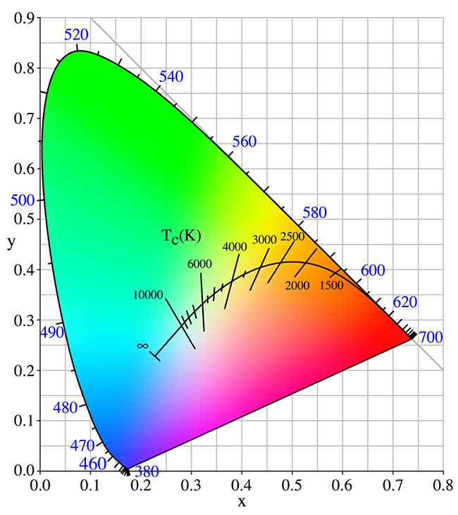
            The segments that crosses blackbody locus curve have the same Correlated Color Temperature (CCT). Daylight locus runs as a parallel curve moved a few dE units towards cyan
            Illustration courtesy of Wikimedia Commons
            But we may have a “white” that does not exactly meet blackbody or daylight behavior, it’s just “near” them. We may define for such whites a “color correlated temperature” (CCT for blackbody, CDT for daylight), the color temperature of the closest white in those loci. Color correlated temperature is an indication of how yellow-blue (warm-cool) a white is, but it does NOT give us information on how far it is from blackbody or daylight loci, how “green” or “magenta” it is. You need to add to that color temperature a distance term, how far in dE terms it is from one of those loci. This concept is very important: correlated color temperature is not sufficient to give us information about whites – with a CCT or CDT we do not know how magenta or green a white point is, only how yellowish-bluish it is.

            تعليق


            • #7
              4) درجة حرارة اللون المرتبطة

              بدلاً من استخدام الطريقة الصحيحة لتسمية اللون من خلال إحداثيات اللون، عادةً ما يتم تناول "اللون الأبيض" من خلال مصطلح "درجة حرارة اللون" معبرًا عنه بدرجات كلفن (K). في الفيزياء، هناك جسم مادي مثالي يشع توزيعًا طيفيًا للطاقة (SPD، توزيع الطاقة عبر الأطوال الموجية) مرتبطًا بدرجة حرارته (هذه نسخة مبسطة جدًا). يشع الجسم الأسود عند 3000 كلفن SPD الذي نراه باللون البرتقالي والأحمر الدافئ، وعند 8000 كلفن يشع SPD نراه باللون الأبيض المزرق. فكر في الأمر كنموذج للتوهج، كما لو كان لديك حدادة وبدأت في تسخين قطعة معدنية بالنار حتى تتوهج. درجة حرارة الجسم الأسود المنخفضة هي "اللون الأكثر دفئًا" (الأصفر - البرتقالي - الأحمر) الذي نراه. إن ارتفاع درجة حرارة الجسم الأسود هو "اللون الأكثر برودة" (الأزرق) الذي نراه. تسمى إحداثيات اللون التي تطابق اللون من الجسم الأسود SPD عند درجات حرارة مختلفة بموضع الجسم الأسود على مخطط ثنائي الأبعاد (مثل CIE xy) وهو منحنى.

              بنفس الطريقة، يمكننا تحديد SPD لضوء النهار بدرجاته المختلفة الأكثر دفئًا وبرودة، ولكل منها إحداثيات لونية في مستوى CIE xy والتي عند رسمها معًا تشكل منحنى: موضع ضوء النهار. تحتوي بعض هذه الألوان البيضاء في ضوء النهار على أسماء محددة مثل "D65" لـ 6500K ضوء النهار SPD أو D50 لـ 5000K ضوء النهار SPD وإحداثيات الألوان الخاصة بها هي هدف معايرة شائع جدًا للشاشات.

              الأجزاء التي تعبر منحنى موضع الجسم الأسود لها نفس درجة حرارة اللون المرتبطة (CCT). يمتد موضع ضوء النهار عندما يتحرك منحنى متوازي ببضع وحدات dE نحو اللون السماوي
              الرسم التوضيحي من ويكيميديا ​​​​كومنز

              ولكن قد يكون لدينا "أبيض" لا يتوافق تمامًا مع سلوك الجسم الأسود أو ضوء النهار، فهو فقط "قريب" منهم. قد نحدد لمثل هؤلاء الأشخاص البيض "درجة الحرارة المرتبطة بالألوان" (CCT للجسم الأسود، وCDT لضوء النهار)، ودرجة حرارة اللون لأقرب لون أبيض في تلك المواقع. درجة الحرارة المرتبطة بالألوان هي مؤشر على مدى اللون الأصفر والأزرق (الدافئ والبارد) للون الأبيض، ولكنها لا تعطينا معلومات عن مدى بعده عن الجسم الأسود أو مواقع ضوء النهار، أو مدى كونه "أخضر" أو "أرجواني". تحتاج إلى إضافة مصطلح مسافة إلى درجة حرارة اللون هذه، أي مدى بُعدها عن أحد تلك المواقع من حيث dE. هذا المفهوم مهم جدًا: درجة حرارة اللون المترابطة ليست كافية لتزويدنا بمعلومات حول اللون الأبيض - مع CCT أو CDT لا نعرف كيف تكون النقطة البيضاء أرجوانية أو خضراء، فقط مدى صفرتها المزرقة.

              تعليق


              • #8

                5) Profiles


                Color managed applications need to know what the actual behavior of a monitor is, so that they can send proper RGB numbers for THAT monitor in order to show a color stored as RGB numbers in a defined color space inside an image or a photograph. To solve this problem we have “ICC profiles”. Other devices like scanners, printers, etc., use profiles to describe their behavior too.

                To keep it simple, a monitor ICC profile (or just “profile”) is just a file with “.icm” or “.icc” extension that stores monitor color behavior for a specific configuration. Among other things we find the following in a monitor profile:
                • Gamut: which are CIE XYZ coordinates of “full” red, green and blue of such monitor in its current state, the location of its primary colors.
                • White Point: what the CIE XYZ coordinates are when monitor outputs white (“full” red, green and blue at the same time) in its current state.
                • Tone Response Curve (TRC), also called gamma. This is a plot of how brightness rises (relative to full maximum output) as you send a bigger R, G or B input value to monitor from zero input to its full input value… in its current state. There is one TRC per RGB channel and it can be equal for R, G and B. A monitor with “true neutral grey” for all grey values (referred to a certain white) should have a red TRC = green TRC = blue TRC. It does not matter what the actual white is, since these TRCs are defined relative to each channel max output, not to actual cd/m2 output per channel.

                There are several ways to store that information, which gives different types of profiles: matrix profiles, cLUT/table profiles… The simplest way is a matrix profile with 3 equal TRCs, this assumes that the monitor has a nearly ideal behavior. The more complex way to store that information is in a table with XYZ color coordinates for several RGB input values and 3 different TRC for each R, G and B channel, in order to capture any non-ideal behavior.

                Profiles for different devices may have different white points or gamuts and it is not useful that every profile knows how to transform its own RGB coordinates to every other profile RGB coordinates with a given rendering intent. It is more useful to transform the RGB coordinates of a profile to a common neutral ground where color managed applications do the transformation from and to that neutral ground. This neutral ground is called Profile Connection Space (PCS). It has a big gamut equal to visible colors (whole CIE XYZ gamut, for example) and it usually has D50 as a reference white.

                Each profile has information about how to transform its own coordinates from or to PCS for some rendering intents. Matrix profiles have information for only relative colorimetric intent transformation.

                تعليق


                • #9
                  5) الملامح

                  تحتاج التطبيقات المُدارة بالألوان إلى معرفة السلوك الفعلي للشاشة، حتى تتمكن من إرسال أرقام RGB المناسبة لتلك الشاشة من أجل إظهار اللون المخزن كأرقام RGB في مساحة لون محددة داخل صورة أو صورة فوتوغرافية. لحل هذه المشكلة لدينا "ملفات تعريف ICC". تستخدم الأجهزة الأخرى مثل الماسحات الضوئية والطابعات وما إلى ذلك ملفات التعريف لوصف سلوكها أيضًا.

                  لتبسيط الأمر، يعد ملف تعريف ICC للشاشة (أو "ملف التعريف" فقط) مجرد ملف بامتداد ".icm" أو ".icc" الذي يخزن سلوك ألوان الشاشة لتكوين معين. من بين أمور أخرى نجد ما يلي في ملف تعريف الشاشة:

                  السلسلة: وهي إحداثيات CIE XYZ للأحمر والأخضر والأزرق "الكامل" لهذه الشاشة في حالتها الحالية، وموقع ألوانها الأساسية. النقطة البيضاء: ما هي إحداثيات CIE XYZ عندما تخرج الشاشة اللون الأبيض (الأحمر "الكامل"، الأخضر والأزرق في نفس الوقت) في حالته الحالية. منحنى استجابة النغمة (TRC)، ويسمى أيضًا جاما. هذا رسم تخطيطي لكيفية ارتفاع السطوع (نسبة إلى الحد الأقصى الكامل للإخراج) عندما ترسل قيمة إدخال R أو G أو B أكبر للمراقبة من صفر إدخال إلى قيمة الإدخال الكاملة... في حالتها الحالية. يوجد TRC واحد لكل قناة RGB ويمكن أن يكون متساويًا لـ R وG وB. يجب أن تحتوي الشاشة ذات "الرمادي المحايد الحقيقي" لجميع القيم الرمادية (المشار إليها باللون الأبيض المعين) على TRC أحمر = TRC أخضر = TRC أزرق. لا يهم ما هو اللون الأبيض الفعلي، حيث يتم تحديد TRCs هذه بالنسبة إلى الحد الأقصى لإخراج كل قناة، وليس إلى إخراج cd/m2 الفعلي لكل قناة.

                  هناك عدة طرق لتخزين تلك المعلومات، مما يوفر أنواعًا مختلفة من ملفات التعريف: ملفات تعريف المصفوفة، وملفات تعريف cLUT/الجدول... وأبسط طريقة هي ملف تعريف مصفوفة يحتوي على 3 TRCs متساوية، وهذا يفترض أن الشاشة لديها سلوك مثالي تقريبًا. الطريقة الأكثر تعقيدًا لتخزين هذه المعلومات هي في جدول بإحداثيات ألوان XYZ للعديد من قيم إدخال RGB و3 TRC مختلفة لكل قناة R وG وB، من أجل التقاط أي سلوك غير مثالي.

                  قد تحتوي ملفات التعريف الخاصة بالأجهزة المختلفة على نقاط بيضاء أو نطاقات مختلفة، وليس من المفيد أن يعرف كل ملف تعريف كيفية تحويل إحداثيات RGB الخاصة به إلى كل إحداثيات RGB لملف تعريف آخر بهدف عرض معين. من المفيد أكثر تحويل إحداثيات RGB لملف التعريف إلى أرضية محايدة مشتركة حيث تقوم التطبيقات المُدارة بالألوان بالتحويل من وإلى تلك الأرض المحايدة. تسمى هذه الأرضية المحايدة مساحة اتصال ملف التعريف (PCS). يحتوي على نطاق كبير يساوي الألوان المرئية (نطاق CIE XYZ بأكمله، على سبيل المثال) وعادةً ما يحتوي على D50 كأبيض مرجعي.

                  يحتوي كل ملف تعريف على معلومات حول كيفية تحويل الإحداثيات الخاصة به من أو إلى PCS لبعض أغراض العرض. تحتوي ملفات تعريف المصفوفة على معلومات لتحويل الهدف اللوني النسبي فقط.

                  تعليق


                  • #10

                    6) Rendering Intents


                    Color management also states a set of rules about what RGB numbers should be sent to a device (monitor, printer, etc) when a color defined as RGB numbers in a color space falls outside the device’s gamut. That color cannot be shown as intended, but a set of recommendations known as “rendering intents” deal with this situation in a more or less predictable way.

                    Some of them are:
                    • Absolute Colorimetric: This intent aims to show in-gamut colors as they are, clipping colors that the device cannot show.
                    • Relative Colorimetric: It is akin to absolute colorimetric, but when the two color spaces involved have different whites, gamut and its colors are “moved” from one white to the other. Color management is “relative” to each color space white.
                    • Perceptual: It is similar to relative colorimetric, but out of gamut colors are moved in-gamut, pushing or “deforming” inwards the already in-gamut colors. Although this preserves tonal relations in gradients since there is no clipping of out of gamut colors, in-gamut colors may not be shown as intended.

                    If in doubt, relative colorimetric is the safest choice: show me the colors that my device can display, with its current white point, the right way.

                    تعليق


                    • #11
                      6) تقديم النوايا

                      تنص إدارة الألوان أيضًا على مجموعة من القواعد حول أرقام rgb التي يجب إرسالها إلى جهاز (شاشة، طابعة، إلخ) عندما يقع اللون المحدد كأرقام rgb في مساحة الألوان خارج النطاق اللوني للجهاز. لا يمكن عرض هذا اللون على النحو المنشود، لكن مجموعة من التوصيات المعروفة باسم "أهداف العرض" تتعامل مع هذا الموقف بطريقة يمكن التنبؤ بها إلى حد ما.

                      بعض منهم:

                      قياس الألوان المطلق: يهدف هذا الهدف إلى إظهار الألوان في النطاق كما هي، مع قص الألوان التي لا يمكن للجهاز إظهارها. قياس الألوان النسبي: يشبه قياس الألوان المطلق، ولكن عندما يكون لفراغي اللون المعنيين بياض مختلف، فإن التدرج اللوني وألوانه تكون مختلفة "انتقل" من أبيض إلى آخر. تعتبر إدارة الألوان "نسبية" لكل مساحة لون بيضاء. الإدراك الحسي: إنها تشبه قياس الألوان النسبي، ولكن يتم نقل الألوان خارج النطاق داخل النطاق، مما يؤدي إلى دفع أو "تشويه" إلى الداخل داخل الألوان الموجودة بالفعل في النطاق. على الرغم من أن هذا يحافظ على العلاقات اللونية في التدرجات اللونية حيث لا يوجد أي قطع خارج نطاق الألوان، فقد لا يتم عرض الألوان داخل النطاق على النحو المقصود.

                      إذا كنت في شك، فإن قياس الألوان النسبي هو الخيار الأكثر أمانًا: أرني الألوان التي يمكن لجهازي عرضها، مع النقطة البيضاء الحالية، بالطريقة الصحيحة.

                      تعليق


                      • #12

                        7) Calibration


                        Sometimes a monitor needs to be configured for a very specific white (CIE XYZ white point coordinates) or a tone response curve behavior (neutral grey and a specific gamma value) or to a certain brightness. Since white is the sum of red, green and blue output, we can lower the max brightness value of each channel until the white output matches our desired color of white (white point). In the same way we can vary the “middle” red, green and blue output, so that the resulting greys have the same color as white (so that they are neutral relative to white) or to have a specific brightness for each grey (gamma). We could write this information as a table: for each red input number to the monitor from zero to full input (table input) we want a specific red brightness, so we calculate which input number for the red channel behaves in that way (table output). The same applies to green and blue.

                        This process is known as calibration, to make a monitor behave in a particular way (or close to it). Information of what red, green and blue “numbers” should be fed to a device so we get the grey colors we want to show on that device, is called “calibration curves”. There is one per channel and they may be used to correct the white point too, since a monitor’s white is just the brightest of its grays.

                        Most monitors have button controls to lower maximum light output of R, G and B channel (you known them as “brightness”, “contrast” and “RGB Gain” controls), so white point can be fixed inside a monitor, without the help of external tools. Other displays cannot do that, because they lack such controls (like laptops).

                        A few monitors allow changing its grey response because they are able to store at user command a set of custom calibration curves in their own electronic components. If a monitor has such a feature, we say it has “hardware calibration”, because it has a LUT (Lookup Table) to store calibration curves. For monitors without such a feature, almost every graphics card (GPU to keep it short) inside a computer has a LUT for each DVI, HDMI or DisplayPort(DP)/Thunderbolt output.

                        Since we output discrete RGB numbers to a monitor, usually from 0 to 255 for each channel, and since a monitor accepts a discrete RGB number as input, usually from 0 to 255, then if we modify this one-to-one translation with a calibration curve, we may be introducing “gaps” or “jumps” in that 256 step stair. Such gaps may result in visible jumps between neighbor grey values and even coloration of some grays (red, green or blue tint in them). The bigger the gap, the more noticeable it is. It does not matter where those calibration curves are stored (inside the monitor or in a graphics card LUT) – a one-to-one transformation modification of a discrete value to another may result in noticeable gaps.

                        تعليق


                        • #13
                          7) المعايرة

                          في بعض الأحيان، تحتاج الشاشة إلى تكوينها للحصول على لون أبيض محدد للغاية (إحداثيات النقطة البيضاء CIE XYZ) أو سلوك منحنى استجابة النغمة (رمادي محايد وقيمة جاما محددة) أو إلى سطوع معين. نظرًا لأن اللون الأبيض هو مجموع مخرجات الأحمر والأخضر والأزرق، فيمكننا خفض قيمة السطوع القصوى لكل قناة حتى يتطابق الناتج الأبيض مع اللون الأبيض المطلوب (النقطة البيضاء). بنفس الطريقة يمكننا تغيير الناتج الأحمر والأخضر والأزرق "المتوسط"، بحيث يكون للرمادي الناتج نفس لون اللون الأبيض (بحيث يكون محايدًا بالنسبة إلى الأبيض) أو يكون له سطوع محدد لكل رمادي (جاما) ). يمكننا كتابة هذه المعلومات كجدول: لكل رقم إدخال أحمر للشاشة من الصفر إلى الإدخال الكامل (إدخال الجدول) نريد سطوعًا أحمر محددًا، لذلك نحسب رقم الإدخال للقناة الحمراء الذي يتصرف بهذه الطريقة (إخراج الجدول ). الأمر نفسه ينطبق على الأخضر والأزرق.

                          تُعرف هذه العملية باسم المعايرة، لجعل الشاشة تتصرف بطريقة معينة (أو قريبة منها). المعلومات المتعلقة بالأرقام الحمراء والخضراء والزرقاء التي يجب إدخالها إلى الجهاز حتى نحصل على الألوان الرمادية التي نريد إظهارها على هذا الجهاز، تسمى "منحنيات المعايرة". توجد نقطة واحدة لكل قناة ويمكن استخدامها لتصحيح النقطة البيضاء أيضًا، نظرًا لأن اللون الأبيض في الشاشة هو ألمع درجات اللون الرمادي.

                          تحتوي معظم الشاشات على أزرار تحكم لتقليل الحد الأقصى لخرج الضوء لقناة R وG وB (تعرفها بعناصر التحكم "السطوع" و"التباين" و"RGB Gain")، لذلك يمكن تثبيت النقطة البيضاء داخل الشاشة، دون مساعدة من الأدوات الخارجية. لا تستطيع شاشات العرض الأخرى القيام بذلك، لأنها تفتقر إلى مثل هذه الضوابط (مثل أجهزة الكمبيوتر المحمولة).

                          تسمح بعض الشاشات بتغيير استجابتها الرمادية لأنها قادرة على تخزين مجموعة من منحنيات المعايرة المخصصة في مكوناتها الإلكترونية بناءً على أمر المستخدم. إذا كانت الشاشة تحتوي على مثل هذه الميزة، نقول إنها تحتوي على "معايرة الأجهزة"، لأنها تحتوي على LUT (جدول البحث) لتخزين منحنيات المعايرة. بالنسبة للشاشات التي لا تحتوي على مثل هذه الميزة، فإن كل بطاقة رسومات تقريبًا (وحدة معالجة الرسومات لإبقائها قصيرة) داخل الكمبيوتر بها جدول بحث لكل مخرج DVI أو HDMI أو DisplayPort(DP)/Thunderbolt.

                          نظرًا لأننا نقوم بإخراج أرقام RGB منفصلة إلى الشاشة، عادةً من 0 إلى 255 لكل قناة، وبما أن الشاشة تقبل رقم RGB منفصل كمدخل، عادةً من 0 إلى 255، فإذا قمنا بتعديل هذه الترجمة من واحد إلى واحد باستخدام منحنى المعايرة، ربما ندخل "فجوات" أو "قفزات" في هذا الدرج المكون من 256 درجة. قد تؤدي مثل هذه الفجوات إلى قفزات مرئية بين القيم الرمادية المجاورة وحتى تلوين بعض الألوان الرمادية (لون أحمر أو أخضر أو ​​أزرق فيها). كلما كانت الفجوة أكبر، كلما كانت ملحوظة أكثر. لا يهم مكان تخزين منحنيات المعايرة هذه (داخل الشاشة أو في بطاقة الرسومات LUT) - فقد يؤدي تعديل التحويل من واحد إلى واحد لقيمة منفصلة إلى أخرى إلى حدوث فجوات ملحوظة.

                          تعليق


                          • #14
                            To avoid these issues, there is a mathematical tool known as “temporal dithering”. The basic concept is to use “time” to solve lack of step resolution, so it’s possible to create a “visual step” in the middle of the gap. For example, calibration curve says that for “128,128,128” RGB input number sent from a computer, the monitor should work as if “128.5, 123.75, 129.25” values were the actual input, in order to get a neutral grey with a desired brightness. If a monitor (or its internal components) only accepts discrete values from 0 to 255 in steps of 1 unit, not decimals, then rounding such transformation to “128,124,129” may result in an excess of green, a green tint for that grey, a gap or band (hence the term “banding”) in a grey gradient from black to white because of this rounding error. With the help of temporal dithering, we can “move” these “decimal values” to time with a device that only accepts 1 unit per step as input, just changing value for each time step, so overall value across a time interval will be our desired value, with decimal values. For example, let’s take an interval sequence from t1 to t4 for the same grey correction:

                            t1:”128,124,129” -> t2:”129,124,129” -> t3:”128,123,130” -> t4:”129,124,129”

                            Like in cinema, tiny time steps (fast enough frames) are not noticeable and our eyes perceive it as if the monitor (or its internal components) was fed with intended correction “128.5, 123.75,129.25”.

                            Monitors with hardware calibration have LUTs capable of storing high bit depth calibration curves (more than 8-bit, more than 256 steps, with “decimal values”) even if the input to the monitor is limited to 256 steps. With the help of temporal dithering, electronic units can output calibration to lower bit depth electronics (lower than LUT, without “decimal values support” like for example 8-bit – 256 steps) in a smooth way, without gaps. This results in smooth gradients thanks to high bit depth LUT AND dithering.

                            Monitors without hardware calibration need a graphics card with a high bit depth LUT and temporal dithering units in order to achieve the same thing. The ugly part of the tale is that more than half of graphics cards cannot do that: NVIDIA GeForce series and Intel Integrated Graphics cards cannot do it, so every calibration curve different from “no translation”/”no calibration” may result in awful banding artifacts. The bigger the gap in calibration curves, the more noticeable banding will be.

                            If you want (or are forced) to use graphics card calibration, it is HIGHLY recommended that you get an AMD/ATI graphics card (gamer “Radeon” or professional “FirePro”) or NVIDIA Quadro graphics card (professional market). This is the only way to avoid every kind of banding artifacts caused by calibration curves loaded in graphics card LUT.

                            Keep in mind that since monitors with hardware calibration are plugged to a graphics card, their behavior could be modified too by calibration curves stored in graphics card LUT (GPU LUT to keep it short). ICC profiles contain a tag called VCGT (video card gamma table) with calibration curves table that must be sent to graphics card LUT. For hardware calibration capable monitors, their ICC profiles contain a linear input=output calibration curve, so no graphics card calibration is applied when that ICC profile is active.

                            تعليق


                            • #15
                              لتجنب هذه المشكلات، هناك أداة رياضية تعرف باسم “التردد الزمني”. المفهوم الأساسي هو استخدام "الوقت" لحل مشكلة عدم دقة الخطوات، لذلك من الممكن إنشاء "خطوة مرئية" في منتصف الفجوة. على سبيل المثال، يوضح منحنى المعايرة أنه بالنسبة لرقم إدخال RGB "128,128,128" المرسل من جهاز كمبيوتر، يجب أن تعمل الشاشة كما لو كانت القيم "128.5، 123.75، 129.25" هي الإدخال الفعلي، من أجل الحصول على لون رمادي محايد مع السطوع المطلوب. إذا كانت الشاشة (أو مكوناتها الداخلية) تقبل فقط القيم المنفصلة من 0 إلى 255 في خطوات مكونة من وحدة واحدة، وليس الكسور العشرية، فإن تقريب هذا التحويل إلى "128,124,129" قد يؤدي إلى زيادة في اللون الأخضر، ولون أخضر لذلك اللون الرمادي، فجوة أو شريط (ومن هنا جاء مصطلح "النطاقات") بتدرج رمادي من الأسود إلى الأبيض بسبب خطأ التقريب هذا. بمساعدة التردد الزمني، يمكننا "نقل" هذه "القيم العشرية" إلى الوقت باستخدام جهاز يقبل فقط وحدة واحدة لكل خطوة كمدخل، فقط قم بتغيير القيمة لكل خطوة زمنية، وبالتالي فإن القيمة الإجمالية عبر فترة زمنية ستكون لدينا القيمة المطلوبة، مع القيم العشرية. على سبيل المثال، لنأخذ تسلسلًا زمنيًا من t1 إلى t4 لنفس تصحيح اللون الرمادي:

                              t1: "128,124,129" -> t2: "129,124,129" -> t3: "128,123,130" -> t4: "129,124,129"

                              كما هو الحال في السينما، لا يمكن ملاحظة الخطوات الزمنية الصغيرة (إطارات سريعة بما يكفي) وترى أعيننا ذلك كما لو أن الشاشة (أو مكوناتها الداخلية) قد تم تغذيتها بالتصحيح المقصود "128.5، 123.75،129.25".

                              تحتوي الشاشات المزودة بمعايرة الأجهزة على جداول LUT قادرة على تخزين منحنيات معايرة ذات عمق بت عالي (أكثر من 8 بت، وأكثر من 256 خطوة، مع "قيم عشرية") حتى لو كان الإدخال إلى الشاشة محدودًا بـ 256 خطوة. بمساعدة التردد الزمني، يمكن للوحدات الإلكترونية إخراج المعايرة إلى إلكترونيات ذات عمق بت أقل (أقل من LUT، دون "دعم القيم العشرية" مثل على سبيل المثال 8 بت - 256 خطوة) بطريقة سلسة، دون فجوات. وينتج عن ذلك تدرجات سلسة بفضل عمق البت العالي والتردد.

                              تحتاج الشاشات التي لا تحتوي على معايرة الأجهزة إلى بطاقة رسومات ذات عمق بت عالي LUT ووحدات ثبات زمنية لتحقيق نفس الشيء. الجزء القبيح من القصة هو أن أكثر من نصف بطاقات الرسومات لا يمكنها القيام بذلك: سلسلة NVIDIA GeForce وبطاقات الرسومات المدمجة من Intel لا يمكنها القيام بذلك، لذا فإن كل منحنى معايرة مختلف عن "لا توجد ترجمة"/"لا توجد معايرة" قد يؤدي إلى نطاقات فظيعة الآثار. كلما زادت الفجوة في منحنيات المعايرة، أصبح النطاق أكثر وضوحًا.

                              إذا كنت تريد (أو كنت مجبرًا) على استخدام معايرة بطاقة الرسومات، فمن المستحسن بشدة أن تحصل على بطاقة رسومات AMD/ATI (للاعب "Radeon" أو "FirePro" الاحترافي) أو بطاقة رسومات NVIDIA Quadro (للسوق الاحترافية). هذه هي الطريقة الوحيدة لتجنب كل أنواع عيوب النطاقات الناتجة عن منحنيات المعايرة المحملة في LUT لبطاقة الرسومات.

                              ضع في اعتبارك أنه بما أن الشاشات المزودة بمعايرة الأجهزة موصولة ببطاقة رسومات، فيمكن تعديل سلوكها أيضًا عن طريق منحنيات المعايرة المخزنة في بطاقة الرسومات LUT (GPU LUT لإبقائها قصيرة). تحتوي ملفات تعريف ICC على علامة تسمى VCGT (جدول جاما لبطاقة الفيديو) مع جدول منحنيات المعايرة الذي يجب إرساله إلى بطاقة الرسومات LUT. بالنسبة للشاشات القادرة على معايرة الأجهزة، تحتوي ملفات تعريف ICC الخاصة بها على منحنى معايرة خطي للإدخال = الإخراج، لذلك لا يتم تطبيق معايرة بطاقة الرسومات عندما يكون ملف تعريف ICC نشطًا.

                              تعليق

                              يعمل...
                              X