sRGB vs Adobe RGB vs ProPhoto RGB إس آر جي بي مقابل أدوبي RGB مقابل ProPhoto RGB

تقليص
X
 
  • تصفية - فلترة
  • الوقت
  • عرض
إلغاء تحديد الكل
مشاركات جديدة

  • sRGB vs Adobe RGB vs ProPhoto RGB إس آر جي بي مقابل أدوبي RGB مقابل ProPhoto RGB

    sRGB vs Adobe RGB vs ProPhoto RGB
    إس آر جي بي مقابل أدوبي RGB مقابل ProPhoto RGB


    Color spaces are essential in photography; they apply in some way to every photo you take. The most well-known color spaces are sRGB, Adobe RGB, and ProPhoto RGB. But what makes them so important? Beware: There’s a lot of misinformation about this topic online. Outdated and inaccurate recommendations abound – but so does a lot of valuable information, if you’re willing to learn it. This article introduces sRGB, Adobe RGB, and ProPhoto RGB, and when to use each one.


    I’ll preface this article, like most technical articles I write, by saying that this is a complex subject! You might want to dig down and read it a couple times to fully internalize how everything works. I did my best to write it all in plain English, as well as define complex terms in context, so hopefully it’s still easy to understand. You’re also free to ask questions in the comments section at the end, and I’m happy to help clarify anything you’re still wondering about.

    مساحات الألوان ضرورية في التصوير الفوتوغرافي؛ تنطبق بطريقة ما على كل صورة تلتقطها. مساحات الألوان الأكثر شهرة هي sRGB، وAdobe RGB، وProPhoto RGB. ولكن ما الذي يجعلهم في غاية الأهمية؟ احذر: هناك الكثير من المعلومات الخاطئة حول هذا الموضوع عبر الإنترنت. تكثر التوصيات القديمة وغير الدقيقة، ولكن هناك أيضًا الكثير من المعلومات القيمة، إذا كنت على استعداد لتعلمها. تقدم هذه المقالة sRGB وAdobe RGB وProPhoto RGB ومتى يتم استخدام كل منها.

    سأستهل هذا المقال، مثل معظم المقالات التقنية التي أكتبها، بالقول إن هذا موضوع معقد! قد ترغب في التنقيب فيه وقراءته عدة مرات لاستيعاب كيفية عمل كل شيء بشكل كامل. لقد بذلت قصارى جهدي لكتابة كل ذلك باللغة الإنجليزية البسيطة، بالإضافة إلى تحديد المصطلحات المعقدة في السياق، لذلك آمل أن يكون من السهل فهمها. لديك أيضًا الحرية في طرح الأسئلة في قسم التعليقات في النهاية، ويسعدني المساعدة في توضيح أي شيء لا تزال تتساءل عنه.


  • #2
    Table of Contents
    جدول المحتويات

    ما هي sRGB وAdobe RGB وProPhoto RGB؟ فهم قيم RGBفهم عمق البت هل تحتوي الصور في مساحات الألوان الكبيرة على ألوان أكثر من غيرها؟ عمق البت والنطاق مساحة العمل مقابل مساحة الإخراج مساحة العمل مساحة الإخراج متى يجب أن تستخدم sRGB وAdobe RGB وProPhoto RGB؟sRGBProPhoto RGBAdobe طباعة الصور RGBطريقتا الطباعة هل يجب أن تتطابق الطباعة مع شاشتك؟ ماذا عن معايرة الشاشة وتوصيفها؟الخلاصة

    تعليق


    • #3
      1. What Are sRGB, Adobe RGB, and ProPhoto RGB?


      sRGB, Adobe RGB, and ProPhoto RGB are three of the most commonly used color spaces in photography.

      “Color spaces” is not some fancy term meant to confuse or bewilder. It just means a set of colors – a container, almost. If you have two paints (say, red and blue) plus a white canvas, your entire color space is just the colors you can make by mixing the two paints. And yes, that includes painting more lightly to let some of the white canvas shine through.

      A good way to envision color spaces is to look at a set of all the colors people can see. (If no one can see it, it’s not a “color” anyway – colors are subjective like that.) You may have seen an illustration like this before:
      All the colors the human visual system can see. Courtesy Wikipedia, public domain.
      The diagram above represents every color we can see, although note that it’s a two dimensional figure (x and y axis only), so it doesn’t account for darker colors, i.e., luminance.

      So, how do sRGB, Adobe RGB, and ProPhoto RGB fit into this? Quite simply, they intersect with the diagram above (and, in the case of ProPhoto, actually stretch beyond it in places). Here are the different shapes of the sRGB, Adobe RGB, and ProPhoto color spaces. If you’re first learning about these three color spaces, the simple diagrams below might answer some of your questions already:


      And here’s how they all look overlaid together:


      تعليق


      • #4
        1. ما هي sRGB وAdobe RGB وProPhoto RGB؟

        تُعد sRGB وAdobe RGB وProPhoto RGB ثلاثة من مساحات الألوان الأكثر استخدامًا في التصوير الفوتوغرافي.

        "المساحات الملونة" ليست مصطلحًا خياليًا يهدف إلى الخلط أو الحيرة. إنه يعني فقط مجموعة من الألوان - حاوية تقريبًا. إذا كان لديك لونين (على سبيل المثال، الأحمر والأزرق) بالإضافة إلى لوحة بيضاء، فإن مساحة الألوان بأكملها هي الألوان التي يمكنك إنشاؤها عن طريق مزج الطلاءين. ونعم، يتضمن ذلك الرسم بشكل خفيف للسماح لبعض القماش الأبيض بالتألق.

        إحدى الطرق الجيدة لتصور مساحات الألوان هي النظر إلى مجموعة من جميع الألوان التي يمكن للناس رؤيتها. (إذا لم يتمكن أحد من رؤيته، فهو ليس "لونًا" على أي حال - فالألوان ذاتية من هذا القبيل.) ربما تكون قد شاهدت رسمًا توضيحيًا مثل هذا من قبل:

        جميع الألوان التي يستطيع الجهاز البصري البشري رؤيتها. مجاملة من ويكيبيديا، المجال العام.

        يمثل الرسم البياني أعلاه كل لون يمكننا رؤيته، على الرغم من ملاحظة أنه شكل ثنائي الأبعاد (المحور x وy فقط)، لذا فهو لا يأخذ في الاعتبار الألوان الداكنة، أي النصوع.

        إذًا، كيف تتناسب sRGB وAdobe RGB وProPhoto RGB مع هذا؟ بكل بساطة، فهي تتقاطع مع الرسم البياني أعلاه (وفي حالة ProPhoto، فإنها تمتد في الواقع إلى ما هو أبعد من ذلك في بعض الأماكن). فيما يلي الأشكال المختلفة لمساحات الألوان sRGB وAdobe RGB وProPhoto. إذا كنت تتعرف لأول مرة على مساحات الألوان الثلاثة هذه، فقد تجيب المخططات البسيطة أدناه على بعض أسئلتك بالفعل:


        وإليك كيف تبدو جميعها متراكبة معًا:


        تعليق


        • #5
          As you can see, sRGB is the smallest color space, with a gamut (another word for range) only covering a small portion of what our own eyes can see. The Adobe RGB gamut is larger, particularly in the green and cyan colors. It allows for more saturation (“chroma”) in those areas.

          ProPhoto RGB is the largest of the three – and possibly the most interesting, since it includes “colors” outside what we can see. We call these imaginary colors just to induce fear in other photographers. You physically cannot see them; that’s what makes them imaginary. They aren’t especially important to this discussion, though. ProPhoto RGB only includes those values because it allows the gamut of real colors to be larger than that of other color spaces, including sRGB and Adobe RGB.

          Remember, too, that these are just 2D representations. Here’s a 3D image of the sRGB color space (viewed from slightly overhead), so you can visualize the role that luminance plays:
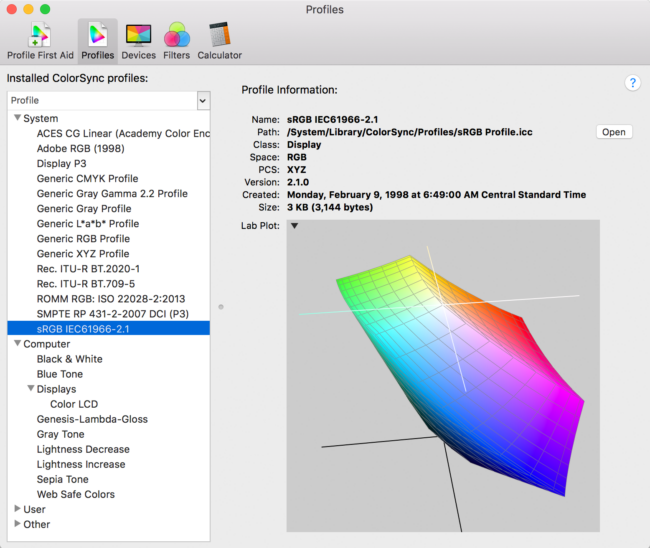
          Screenshot from “ColorSync Utility,” included on Mac

          تعليق


          • #6
            كما ترون، فإن sRGB هي أصغر مساحة لونية، مع نطاق لوني (كلمة أخرى للنطاق) لا يغطي سوى جزء صغير مما يمكن أن تراه أعيننا. نطاق Adobe RGB أكبر، خاصة في الألوان الخضراء والسماوية. فهو يسمح بمزيد من التشبع ("الصفاء") في تلك المناطق.

            ProPhoto RGB هو الأكبر من بين الثلاثة – وربما الأكثر إثارة للاهتمام، لأنه يتضمن “ألوانًا” خارج ما يمكننا رؤيته. نطلق على هذه الألوان الخيالية مجرد إثارة الخوف لدى المصورين الآخرين. لا يمكنك رؤيتهم جسديًا؛ هذا ما يجعلهم خياليين. ومع ذلك، فهي ليست ذات أهمية خاصة لهذه المناقشة. يتضمن ProPhoto RGB هذه القيم فقط لأنه يسمح لنطاق الألوان الحقيقية بأن يكون أكبر من نطاق مساحات الألوان الأخرى، بما في ذلك sRGB وAdobe RGB.

            تذكر أيضًا أن هذه مجرد تمثيلات ثنائية الأبعاد. فيما يلي صورة ثلاثية الأبعاد لمساحة الألوان sRGB (يتم عرضها من أعلى قليلاً)، حتى تتمكن من تصور الدور الذي تلعبه النصوع:

            لقطة شاشة من "ColorSync Utility"، المضمنة في نظام Mac

            تعليق


            • #7
              2. Understanding RGB Values


              Let’s say that you want to specify a particular color, maybe a slight shade of beige-white. Color spaces are defined mathematically. Every color you could possibly think of has, essentially, its own “coordinates” within the color space so you can find it exactly. But keep in mind that these coordinates are specific to each color space. The same values won’t result in the same color in both sRGB and Adobe RGB, for example.

              “RGB” stands for red, green, blue. This is what specifies the color you’re looking for – three values, one each for red, green, and blue. In sRGB color space, the beige-white color in question is specified as RGB 255, 248, 231 – meaning that the red channel value is 255, green is 248, and blue is 231.

              But “255, 248, 231” points to a different color in Adobe RGB space, as well as in ProPhoto RGB space. That is very important to know; it’s why your photos need to include information about their color space. Otherwise, how can a computer application know what color you mean by “255, 248, 231”? It simply can’t tell.

              Spoiler alert: Despite how important it is, some applications don’t read the color space of a photo. They just assume you’re using a default color space (more on that later). This is a problem for hopefully obvious reasons. You don’t want your browser or application to see the RGB coordinates “120, 140, 160” in both sRGB and ProPhoto color spaces and think they’re the same color.

              تعليق


              • #8
                2. فهم قيم RGB

                لنفترض أنك تريد تحديد لون معين، ربما ظلًا خفيفًا من اللون البيج والأبيض. يتم تعريف مساحات اللون رياضيا. كل لون يمكن أن تفكر فيه له، بشكل أساسي، "إحداثيات" خاصة به داخل مساحة اللون حتى تتمكن من العثور عليه بالضبط. لكن ضع في اعتبارك أن هذه الإحداثيات خاصة بكل مساحة لونية. لن تؤدي نفس القيم إلى نفس اللون في كل من sRGB وAdobe RGB، على سبيل المثال.

                يشير "RGB" إلى اللون الأحمر والأخضر والأزرق. هذا هو ما يحدد اللون الذي تبحث عنه – ثلاث قيم، واحدة لكل من الأحمر والأخضر والأزرق. في مساحة الألوان sRGB، يتم تحديد اللون البيج والأبيض المعني على أنه RGB 255، 248، 231 - مما يعني أن قيمة القناة الحمراء هي 255، والأخضر 248، والأزرق 231.

                لكن "255، 248، 231" تشير إلى لون مختلف في مساحة Adobe RGB، وكذلك في مساحة ProPhoto RGB. من المهم جدًا معرفة ذلك؛ ولهذا السبب تحتاج صورك إلى تضمين معلومات حول مساحة الألوان الخاصة بها. وإلا كيف يمكن لتطبيق كمبيوتر أن يعرف ما هو اللون الذي تقصده بـ "255، 248، 231"؟ ببساطة لا يمكن أن أقول.

                تنبيه لحرق المعلومات: على الرغم من أهمية ذلك، إلا أن بعض التطبيقات لا تقرأ مساحة الألوان الخاصة بالصورة. إنهم يفترضون فقط أنك تستخدم مساحة اللون الافتراضية (المزيد حول ذلك لاحقًا). هذه مشكلة لأسباب واضحة ونأمل. لا تريد أن يرى متصفحك أو تطبيقك إحداثيات RGB "120، 140، 160" في مساحات الألوان sRGB وProPhoto وتعتقد أنهما نفس اللون.

                تعليق


                • #9

                  3. Understanding Bit Depth


                  Another important topic to this discussion is bit depth, also known as color depth – simply how many bits of data are used to create each pixel.

                  The baseline in photography is usually 8 bits per pixel, meaning that each individual pixel can represent 2^8 or 256 colors. But your camera has red, green, and blue pixels. So that’s 256 shades of red, 256 shades of green, and 256 shades of blue. The total is 256 x 256 x 256, or a whopping 16,777,216 RGB values.

                  But why stop there? It’s common to work with photos up to 16 bit per channel, leading to an incredible 281 trillion RGB values at your disposal. Although this may seem absurd and unnecessary – it’s far more than the human visual system can perceive – there are benefits to using 16-bit color while you’re editing a photo. Specifically, it makes gradients in an image as smooth as possible, with minimal banding.

                  (Note that calling all of these 281 trillion RGB points “colors” is a bit misleading, since color is defined based on human perception. Sure, there are trillions of “color codes,” but many of them are too similar for us to notice a difference. And recall that some of ProPhoto’s color codes refer to imaginary colors anyway – ones we cannot see.)

                  تعليق


                  • #10
                    3. فهم عمق البت

                    هناك موضوع آخر مهم في هذه المناقشة وهو عمق البت، والمعروف أيضًا باسم عمق الألوان - وهو ببساطة عدد وحدات بت البيانات المستخدمة لإنشاء كل بكسل.

                    عادة ما يكون خط الأساس في التصوير الفوتوغرافي 8 بت لكل بكسل، مما يعني أن كل بكسل فردي يمكن أن يمثل 2^8 أو 256 لونًا. لكن الكاميرا تحتوي على وحدات بكسل حمراء وخضراء وزرقاء. إذن، لدينا 256 درجة من اللون الأحمر، و256 درجة من اللون الأخضر، و256 درجة من اللون الأزرق. الإجمالي هو 256 × 256 × 256، أو 16,777,216 قيمة RGB.

                    ولكن لماذا تتوقف عند هذا الحد؟ من الشائع العمل مع صور تصل إلى 16 بت لكل قناة، مما يؤدي إلى 281 تريليون قيمة RGB مذهلة تحت تصرفك. على الرغم من أن هذا قد يبدو سخيفًا وغير ضروري - فهو أكثر بكثير مما يمكن للنظام البصري البشري إدراكه - إلا أن هناك فوائد لاستخدام ألوان 16 بت أثناء تحرير الصورة. على وجه التحديد، فهو يجعل التدرجات في الصورة سلسة قدر الإمكان، مع الحد الأدنى من النطاقات.

                    (لاحظ أن تسمية جميع نقاط RGB البالغ عددها 281 تريليون نقطة بـ "ألوان" هو أمر مضلل بعض الشيء، نظرًا لأن اللون يتم تعريفه بناءً على الإدراك البشري. بالتأكيد، هناك تريليونات من "رموز الألوان"، ولكن الكثير منها متشابه جدًا بحيث لا يمكننا ملاحظتها فرق. وتذكر أن بعض رموز الألوان في ProPhoto تشير إلى ألوان خيالية على أي حال - ألوان لا يمكننا رؤيتها.)

                    تعليق


                    • #11
                      3.1. Do Photos in Large Color Spaces Have More Colors than Others?


                      One major confusion I often see is the idea that photos in large color spaces like ProPhoto have “more colors” than others.

                      No! The color space of a photo says nothing about total number of colors in an image. ProPhoto RGB may be “bigger” in terms of range, but an image in ProPhoto RGB color space doesn’t have more colors than a photo in sRGB. An 8-bit per channel photo is limited to about 16.8 million RGB values, no matter what color space it’s in. Those values are simply spread out farther in color spaces like ProPhoto – potentially leading to a problem known as banding.
                      3.2. Bit Depth and Banding


                      The larger your color space, the more important it is that you work with higher bit depth photos. In sRGB, using 8-bit per channel color will often result in smooth gradients that are just fine, with no perceptible banding. But those same 16.8 million colors in ProPhoto will be by definition farther apart from one another, since they’re spreading out to fill a bigger “container.” This makes it more likely that you’ll see banding in gradients in your photos.
                      Note the blocky transitions in this gradient. This is known as banding.
                      You can work around this easily by avoiding 8-bit color with ProPhoto images.

                      تعليق


                      • #12
                        3.1. هل تحتوي الصور الموجودة في مساحات الألوان الكبيرة على ألوان أكثر من غيرها؟

                        أحد الارتباكات الرئيسية التي أراها غالبًا هي فكرة أن الصور ذات المساحات الملونة الكبيرة مثل ProPhoto تحتوي على "ألوان أكثر" من غيرها.

                        لا! لا توضح مساحة الألوان في الصورة شيئًا عن إجمالي عدد الألوان في الصورة. قد يكون ProPhoto RGB "أكبر" من حيث النطاق، ولكن الصورة في مساحة ألوان ProPhoto RGB لا تحتوي على ألوان أكثر من الصورة في sRGB. تقتصر صورة 8 بت لكل قناة على حوالي 16.8 مليون قيمة RGB، بغض النظر عن مساحة اللون الموجودة فيها. وتنتشر هذه القيم ببساطة في مساحات الألوان مثل ProPhoto - مما قد يؤدي إلى مشكلة تعرف باسم النطاقات.

                        3.2. عمق البت والنطاقات

                        كلما كانت مساحة الألوان الخاصة بك أكبر، زادت أهمية العمل مع صور ذات عمق بت أكبر. في sRGB، غالبًا ما يؤدي استخدام لون 8 بت لكل قناة إلى تدرجات سلسة جيدة، دون أي نطاقات ملحوظة. لكن نفس تلك الألوان البالغ عددها 16.8 مليون لون في ProPhoto ستكون بحكم التعريف أبعد عن بعضها البعض، لأنها تنتشر لملء "حاوية" أكبر. وهذا يزيد من احتمالية ظهور نطاقات متدرجة في صورك.

                         لاحظ التحولات الممتلئة في هذا التدرج. يُعرف هذا باسم النطاقات.

                        يمكنك حل هذه المشكلة بسهولة عن طريق تجنب الألوان ذات 8 بت مع صور ProPhoto.

                        تعليق


                        • #13

                          4. Working Space vs Output Space


                          There are two stages along the photo pipeline where you need to choose a color space: post-processing and outputting your image.

                          Okay, if you shoot JPEG (don’t), you also have to make this decision in camera, at least with some cameras (which have sRGB and Adobe RGB options). RAW shooters can ignore this menu option if they want. It will change the preview on the rear of your camera screen, so I recommend picking Adobe RGB, but it doesn’t alter the RAW data you capture.

                          Below, I’ll narrow down the importance of picking the right color space for both post-processing and output.
                          4.1. Working Space


                          When you post-process a photo, you have to choose which working space you’re in. This is the color space your post-processing software restricts you to use; no edit you make can lead to a color found outside your chosen working space. In general, it is ideal that your working space is ProPhoto RGB when you edit a RAW photo. That’s because RAW photos often contain colors outside of both sRGB and Adobe RGB color spaces, especially in high-saturation shadow regions. If your photo’s working space is sRGB, you’ll automatically clip any colors that fall outside the sRGB range for every photo you edit. (Some software, like Lightroom, doesn’t even let you specify sRGB as your working space for this reason.)

                          Photoshop’s ideal settings are a bit tricky, and there are a few different philosophies on the best practices. But if you’re unsure, just set Edit > Color Settings > RGB > Preserve Embedded Profiles. That way, any ProPhoto images you open from Lightroom, Adobe Camera RAW, etc., remain in ProPhoto. And be sure to enable the checkboxes below so you know about any mismatches when they appear. (Another possibility is to select RGB working space to ProPhoto and “Convert to working RGB” so all your Photoshop documents are ProPhoto, for the same result in most cases.)

                          This is critical! A lot of photographers use software like Adobe Camera RAW or Lightroom for many of their important edits, then open the image in Photoshop. But their Lightroom export settings may create images in sRGB or Adobe RGB working space, not realizing that this clips colors beyond it. Instead, click on the blue link at the bottom of Camera RAW and change the images to ProPhoto, 16-bit. In Lightroom, go to Lightroom > External Editing > File Format TIFF, Color Space ProPhoto, Bit Depth 16.

                          Equally critical! If you just realized that you’ve been using sRGB or AdobeRGB for Camera RAW’s or Lightroom’s external editing settings, and you’re rushing to change it to ProPhoto, hang on for just a minute. You’re about to do something useful – you’re avoiding clipping colors outside the sRGB space for no reason – but it comes with some responsibility. You now have an extra step when exporting images from Photoshop to the web: converting them to sRGB. That’s easy to do with Edit > Convert to Profile > sRGB. Converting to sRGB for web images is essential; don’t let a ProPhoto image loose on the world.

                          تعليق


                          • #14
                            4. مساحة العمل مقابل مساحة الإخراج

                            هناك مرحلتان على طول مسار الصور حيث تحتاج إلى اختيار مساحة اللون: المعالجة اللاحقة لصورتك وإخراجها.

                            حسنًا، إذا قمت بالتصوير بصيغة JPEG (لا تقم بذلك)، فسيتعين عليك أيضًا اتخاذ هذا القرار في الكاميرا، على الأقل مع بعض الكاميرات (التي تحتوي على خيارات sRGB وAdobe RGB). يمكن لرماة RAW تجاهل خيار القائمة هذا إذا أرادوا ذلك. سيؤدي ذلك إلى تغيير المعاينة في الجزء الخلفي من شاشة الكاميرا، لذا أوصي باختيار Adobe RGB، لكنه لا يغير بيانات RAW التي تلتقطها.

                            أدناه، سأقوم بتضييق نطاق أهمية اختيار مساحة اللون المناسبة لكل من المعالجة اللاحقة والإخراج.

                            4.1. مساحة العمل

                            عندما تقوم بالمعالجة اللاحقة لصورة ما، يتعين عليك اختيار مساحة العمل التي تتواجد فيها. هذه هي مساحة الألوان التي يقيدك برنامج المعالجة اللاحقة على استخدامها؛ لا يمكن لأي تعديل تجريه أن يؤدي إلى العثور على لون خارج مساحة العمل التي اخترتها. بشكل عام، من المثالي أن تكون مساحة العمل الخاصة بك هي ProPhoto RGB عندما تقوم بتحرير صورة RAW. وذلك لأن صور RAW غالبًا ما تحتوي على ألوان خارج مساحات الألوان sRGB وAdobe RGB، خاصة في مناطق الظل عالية التشبع. إذا كانت مساحة عمل صورتك هي sRGB، فسوف تقوم تلقائيًا بقص أي ألوان تقع خارج نطاق sRGB لكل صورة تقوم بتعديلها. (بعض البرامج، مثل Lightroom، لا تسمح لك بتحديد sRGB كمساحة العمل الخاصة بك لهذا السبب.)

                            تعد الإعدادات المثالية في Photoshop صعبة بعض الشيء، وهناك بعض الفلسفات المختلفة حول أفضل الممارسات. ولكن إذا لم تكن متأكدًا، فما عليك سوى تعيين تحرير > إعدادات اللون > RGB > الاحتفاظ بملفات التعريف المضمنة. بهذه الطريقة، تظل أي صور ProPhoto تفتحها من Lightroom أو Adobe Camera RAW وما إلى ذلك في ProPhoto. وتأكد من تمكين مربعات الاختيار أدناه حتى تعرف أي حالات عدم تطابق عند ظهورها. (الاحتمال الآخر هو تحديد مساحة عمل RGB لـ ProPhoto و"التحويل إلى RGB العامل" بحيث تكون جميع مستندات Photoshop الخاصة بك هي ProPhoto، للحصول على نفس النتيجة في معظم الحالات.)

                            هذا أمر بالغ الأهمية! يستخدم الكثير من المصورين برامج مثل Adobe Camera RAW أو Lightroom لإجراء العديد من تعديلاتهم المهمة، ثم يفتحون الصورة في Photoshop. لكن إعدادات التصدير في Lightroom الخاصة بهم قد تنشئ صورًا في مساحة عمل sRGB أو Adobe RGB، دون أن يدركوا أن هذا يؤدي إلى قص الألوان خارجها. بدلاً من ذلك، انقر فوق الرابط الأزرق الموجود أسفل Camera RAW وقم بتغيير الصور إلى ProPhoto، 16 بت. في Lightroom، انتقل إلى Lightroom > التحرير الخارجي > تنسيق الملف TIFF، Color Space ProPhoto، Bit Depth 16.

                            حرجة بنفس القدر! إذا أدركت للتو أنك تستخدم sRGB أو AdobeRGB لإعدادات التحرير الخارجية لـ Camera RAW أو Lightroom، وتسرع في تغييره إلى ProPhoto، فانتظر لمدة دقيقة فقط. أنت على وشك القيام بشيء مفيد – أنت تتجنب قص الألوان خارج مساحة sRGB بدون سبب – ولكن ذلك يأتي مع بعض المسؤولية. لديك الآن خطوة إضافية عند تصدير الصور من Photoshop إلى الويب: تحويلها إلى sRGB. من السهل القيام بذلك باستخدام تحرير > تحويل إلى ملف تعريف > sRGB. يعد التحويل إلى sRGB لصور الويب أمرًا ضروريًا؛ لا تدع صورة ProPhoto طليقة في العالم.

                            تعليق


                            • #15
                              4.2 Output Space


                              Output space is merely the color space chosen for your final photo. The ideal color space depends on your output medium, but each one – sRGB, Adobe RGB, and ProPhoto – has its uses.

                              For the web, sRGB is generally ideal (more on that in the next section). To send files for other photographers to edit, perhaps ProPhoto is preferable. And for printing, converting directly from a large working space (ProPhoto) to the printer’s specific color space is ideal.

                              Some specific third parties may request photos in sRGB,Adobe RGB, or occasionally ProPhoto. For example, some (low-end) print labs won’t accept photos in any color space other than sRGB or perhaps Adobe RGB. In that case, send what they request, or ideally switch to a different lab.
                              4.2 مساحة الإخراج

                              مساحة الإخراج هي مجرد مساحة اللون المختارة لصورتك النهائية. تعتمد مساحة الألوان المثالية على وسيط الإخراج الخاص بك، ولكن لكل منها - sRGB، وAdobe RGB، وProPhoto - استخداماتها الخاصة.

                              بالنسبة للويب، يعد sRGB مثاليًا بشكل عام (المزيد حول ذلك في القسم التالي). لإرسال ملفات للمصورين الآخرين لتحريرها، ربما يكون ProPhoto هو الأفضل. وبالنسبة للطباعة، يعد التحويل مباشرة من مساحة عمل كبيرة (ProPhoto) إلى مساحة الألوان المحددة للطابعة أمرًا مثاليًا.

                              قد تطلب بعض الجهات الخارجية المحددة صورًا بتنسيق sRGB أو Adobe RGB أو ProPhoto في بعض الأحيان. على سبيل المثال، لن تقبل بعض معامل الطباعة (المنخفضة) الصور في أي مساحة ألوان غير sRGB أو ربما Adobe RGB. في هذه الحالة، أرسل ما يطلبونه، أو انتقل إلى معمل مختلف بشكل مثالي.

                              تعليق

                              يعمل...
                              X