حسن مطبوعاتك بالأسود والأبيض Your Black and White Prints on Any Printer

تقليص
X
 
  • تصفية - فلترة
  • الوقت
  • عرض
إلغاء تحديد الكل
مشاركات جديدة

  • حسن مطبوعاتك بالأسود والأبيض Your Black and White Prints on Any Printer

    A Simple Way to Improve Your Black and White Prints on Any Printer

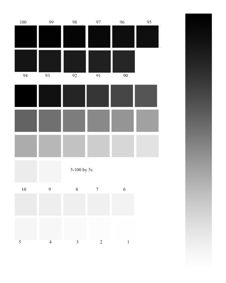
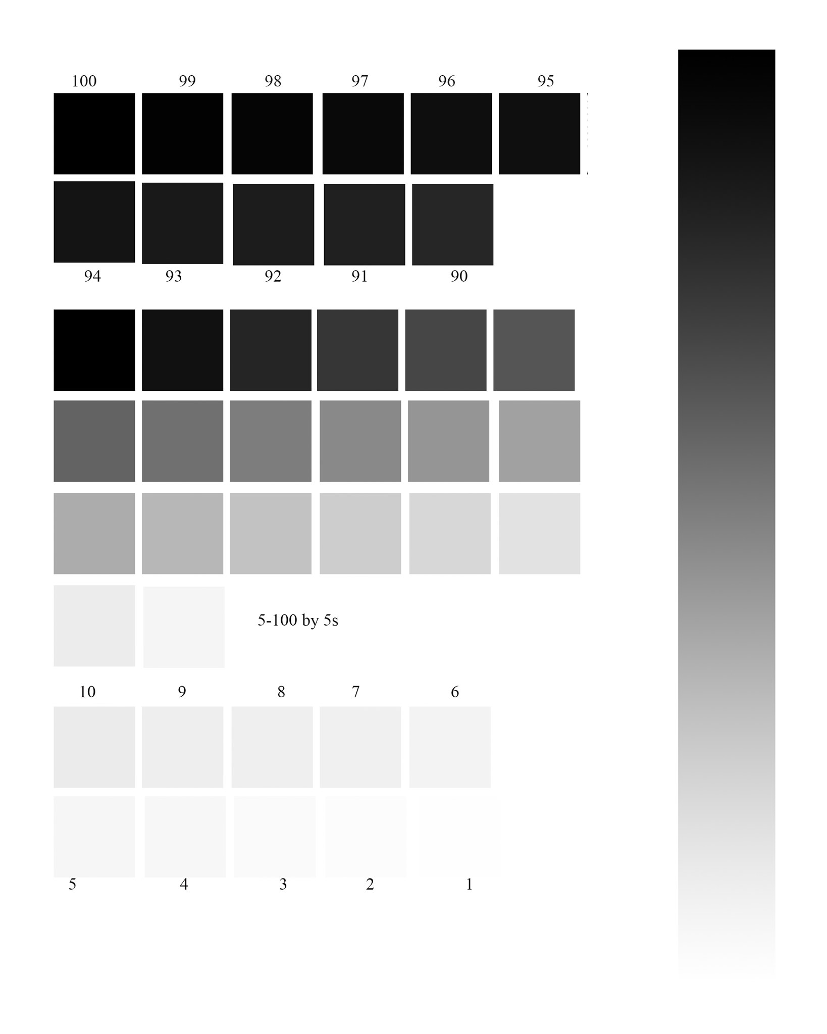
    The secret to a good black-and-white print is controlling the dynamic range. The dynamic range is the range of tones, from the blackest black to the whitest white in an image. In a black and white photograph, you want to make full use of the entire dynamic range. The problem is that, when printing, the printer usually hits the limitations of its dynamic range long before our eye (and camera, and monitor) stops differentiating detail. As the printer lays down ink to create your black tones, there will be a point at which you can no longer differentiate the detail in those blacks anymore. The same is true with white – every printer has a point where white simply becomes “paper white” and you can no longer see any ink at all. And if that’s not bad enough, this “black point” and “white point” will be different for every printer/paper combination!

    Fortunately, there is a simple solution to this problem. By using a simple black and white test chart, you can see how your particular printer and paper handle the white and black areas of your pint and you can edit your picture to maximize the available dynamic range of your printer:


    طريقة بسيطة لتحسين مطبوعاتك بالأبيض والأسود على أي طابعة

    يكمن سر الطباعة الجيدة بالأبيض والأسود في التحكم في النطاق الديناميكي. النطاق الديناميكي هو نطاق درجات الألوان، من اللون الأسود الأكثر سوادًا إلى اللون الأبيض الأكثر بياضًا في الصورة. في الصورة بالأبيض والأسود، تريد الاستفادة الكاملة من النطاق الديناميكي بأكمله. المشكلة هي أنه عند الطباعة، عادةً ما تصل الطابعة إلى حدود نطاقها الديناميكي قبل وقت طويل من توقف أعيننا (والكاميرا والشاشة) عن التمييز بين التفاصيل. عندما تضع الطابعة الحبر لإنشاء درجات اللون الأسود، ستكون هناك نقطة لن تتمكن عندها من التمييز بين التفاصيل في تلك الألوان السوداء بعد الآن. وينطبق الشيء نفسه على اللون الأبيض - كل طابعة لديها نقطة يصبح فيها اللون الأبيض ببساطة "ورقة بيضاء" ولا يمكنك رؤية أي حبر على الإطلاق. وإذا لم يكن هذا سيئًا بما فيه الكفاية، فإن هذه "النقطة السوداء" و"النقطة البيضاء" ستكون مختلفة لكل مجموعة طابعة/ورق!

    ولحسن الحظ، هناك حل بسيط لهذه المشكلة. باستخدام مخطط اختبار بسيط بالأبيض والأسود، يمكنك معرفة كيفية تعامل الطابعة والورق الخاصين بك مع المناطق البيضاء والسوداء في نصف لتر الخاص بك ويمكنك تحرير صورتك لزيادة النطاق الديناميكي المتاح لطابعتك إلى الحد الأقصى:​​

  • #2
    Table of Contents
    جدول المحتويات

    كيفية فهم هذا المخطط (أو إنشاء المخطط الخاص بك)نصائح لطباعة مخطط الاختبار بالأبيض والأسود وتحليلهتحرير الصور بناءً على مخطط الاختبار بالأبيض والأسوداستخدام مخطط الاختبار بالأبيض والأسود في مطبوعاتك الخاصة

    تعليق


    • #3
      How to Understand This Chart (or Make Your Own)


      You can either use the test chart above or create your own. The important part is that you have a document with a black-to-white gradient, and also swatches of gray tones that transition gradually from dark to light in small increments. Whether you’re using this test chart or creating your own, you’ll need to open the info pallet in Photoshop

      In the info pallet, click on one of the eye dropper icons and select RGB color from the drop-down menu. Click on the other eyedropper icon and select grayscale from the drop-down menu.

      If you are creating your own test chart, there are a number of ways you can do this. I prefer to use the grayscale info pallet in 8 bit to measure my gray values, simply because it works on a scale of 1-100, making it simple to create gray swatches with incremental changes in value. If you look at my test chart, the first 11 gray swatches start at black and decrease in lightness by 1% in each square. When you hover your cursor over the squares and look at the k value in the info panel, you will see that it starts at 100% black in the first square, and each square decreases in darkness by 1%.

      In the middle section of squares, I incrementally decrease the darkness of each square by 5%, and in the bottom section the lightness decrease by 1% again, beginning at 10, down to 1. The side of the chart also includes a gradient from pure black to pure white.

      The important part is that you show the decreasing gray values incrementally in small increments. If you choose to create your own chart, how you set that up is up to you.

      كيف تفهم هذا المخطط (أو اصنعه بنفسك)

      يمكنك إما استخدام مخطط الاختبار أعلاه أو إنشاء مخطط خاص بك. الجزء المهم هو أن يكون لديك مستند بتدرج من الأسود إلى الأبيض، وكذلك عينات من درجات اللون الرمادي التي تنتقل تدريجيًا من الداكن إلى الفاتح بزيادات صغيرة. سواء كنت تستخدم هذا المخطط الاختباري أو تنشئ مخططًا خاصًا بك، فستحتاج إلى فتح لوحة المعلومات في Photoshop


      في لوحة المعلومات، انقر فوق أحد أيقونات قطارة العين وحدد لون RGB من القائمة المنسدلة. انقر على أيقونة القطارة الأخرى وحدد التدرج الرمادي من القائمة المنسدلة.


      إذا كنت تقوم بإنشاء مخطط اختبار خاص بك، فهناك عدد من الطرق التي يمكنك من خلالها القيام بذلك. أفضل استخدام لوحة معلومات التدرج الرمادي في 8 بت لقياس قيمي الرمادية، وذلك ببساطة لأنها تعمل على مقياس من 1 إلى 100، مما يجعل من السهل إنشاء عينات رمادية مع تغييرات تدريجية في القيمة. إذا نظرت إلى مخطط الاختبار الخاص بي، فإن أول 11 عينة رمادية تبدأ باللون الأسود وتنخفض في الإضاءة بنسبة 1٪ في كل مربع. عندما تمرر مؤشر الماوس فوق المربعات وتنظر إلى قيمة k في لوحة المعلومات، سترى أنها تبدأ باللون الأسود بنسبة 100% في المربع الأول، وكل مربع يتناقص في الظلام بنسبة 1%.


      في القسم الأوسط من المربعات، أقوم بتقليل ظلام كل مربع تدريجيًا بنسبة 5%، وفي القسم السفلي ينخفض ​​الإضاءة بنسبة 1% مرة أخرى، بدءًا من 10، وصولاً إلى 1. يتضمن جانب المخطط أيضًا تدرجًا من أسود نقي إلى أبيض نقي.

      الجزء المهم هو أن تظهر القيم الرمادية المتناقصة بشكل متزايد بزيادات صغيرة. إذا اخترت إنشاء المخطط الخاص بك، فإن كيفية إعداد ذلك أمر متروك لك.

      تعليق


      • #4
        Tips for Printing and Analyzing Your Black and White Test Chart


        Since this is a printer test chart, it’s not doing us much good on the screen! The next step in this process is to print out your test chart using the same printer, paper, and setting that you intend to use for your photograph. Once you’ve printed it, you’re looking for how your printer/paper combination handles those grayscale values, especially in the whites and blacks.

        When evaluating the blacks, you want to look closely at that top section of swatches. Where can you see a difference in tone from one square to the next? You may find that the first 3 squares look identical, but the fourth one looks lighter. Or you may get all the way down to the second row before you can see a change in tone.

        Evaluate the whites the same way, except this time you’re looking for the point at which you can see the square – the point at which the printer actually starts to lay down a visible layer of ink, and it’s not just paper white. At any point, you can return to the onscreen version and hover over a swatch or a tone on the gradient and see its value in the info panel. You can use the gradient on the side too, to help you see how the various black and white tones are going to reproduce and see how much detail you’re going to retain in the darkest and lightest tones.

        Now that we can see how our printer is going to reproduce those black and white tones in our image, it’s time to put that information to work in creating the best possible photographic print we can. Let’s say that this is the photograph I’m attempting to print:
        X-E2 + XF18-55mmF2.8-4 R LM OIS @ 48.4mm, ISO 400, 1/250, f/16.0
        And for the sake of this example, I’m going to assume that with my printer/paper combination I could begin to see a difference in the black tones at 94%, and I could start to see the white tones at 4%. Every printer and paper combination will be different, so make sure you print a test chart for every paper you use.

        The first thing I do when I open the photograph I want to print in Photoshop is to take a look at the shadow areas. I simply run my cursor over the shadows, with the info panel open so I can get a feel for which areas are darker than that 94%. If you look at the screenshot below, you can see that the shadow area my cursor is hovering over has a black value of 98%, and moving my cursor through those shadows tells me that I have a number of small patches in the 95-99 range that will all print in the same black tone. In this particular image, my highlights are less of a problem, but I do have some spots in the clouds and the rocks that are slightly lighter than that 4% that will be visible in our print. Despite the fact that this image looks great on screen and great to my eye, the test print shows us that there are a few subtle changes we need to make before printing the image.


        نصائح لطباعة وتحليل مخطط الاختبار بالأبيض والأسود

        نظرًا لأن هذا مخطط اختبار للطابعة، فهو لا يفيدنا كثيرًا على الشاشة! الخطوة التالية في هذه العملية هي طباعة مخطط الاختبار الخاص بك باستخدام نفس الطابعة والورق والإعداد الذي تنوي استخدامه لصورتك الفوتوغرافية. بمجرد طباعته، فإنك تبحث عن كيفية تعامل مجموعة الطابعة/الورق مع قيم التدرج الرمادي هذه، خاصة في اللون الأبيض والأسود.

        عند تقييم اللون الأسود، عليك أن تنظر عن كثب إلى القسم العلوي من العينات. أين يمكنك أن ترى اختلافًا في النغمة من مربع إلى آخر؟ قد تجد أن المربعات الثلاثة الأولى تبدو متطابقة، لكن المربع الرابع يبدو أخف. أو قد تصل إلى الصف الثاني قبل أن تتمكن من رؤية التغيير في النغمة.

        قم بتقييم اللون الأبيض بنفس الطريقة، باستثناء أنك تبحث هذه المرة عن النقطة التي يمكنك رؤية المربع عندها - النقطة التي تبدأ عندها الطابعة فعليًا في وضع طبقة مرئية من الحبر، وهي ليست مجرد ورقة بيضاء. في أي وقت، يمكنك العودة إلى الإصدار الذي يظهر على الشاشة والتمرير فوق عينة أو نغمة على التدرج ورؤية قيمتها في لوحة المعلومات. يمكنك استخدام التدرج اللوني على الجانب أيضًا، لمساعدتك في معرفة كيفية إعادة إنتاج درجات اللون الأسود والأبيض المختلفة ومعرفة مقدار التفاصيل التي ستحتفظ بها في الألوان الأغمق والأفتح.

        الآن بعد أن أصبح بإمكاننا أن نرى كيف ستعيد طابعتنا إنتاج تلك الألوان بالأبيض والأسود في صورتنا، فقد حان الوقت لاستخدام هذه المعلومات في إنشاء أفضل طباعة فوتوغرافية ممكنة. لنفترض أن هذه هي الصورة التي أحاول طباعتها:

        X-E2 + XF18-55mmF2.8-4 R LM OIS عند 48.4 مم، ISO 400، 1/250، f/16.0

        ومن أجل هذا المثال، سأفترض أنه باستخدام مجموعة الطابعة/الورق الخاصة بي، يمكنني أن أبدأ في رؤية اختلاف في درجات اللون الأسود بنسبة 94%، ويمكنني أن أبدأ في رؤية درجات اللون الأبيض بنسبة 4%. ستكون كل مجموعة من الطابعة والورق مختلفة، لذا تأكد من طباعة مخطط اختبار لكل ورقة تستخدمها.

        أول شيء أفعله عندما أفتح الصورة التي أريد طباعتها بالفوتوشوب هو إلقاء نظرة على مناطق الظل. أقوم ببساطة بتمرير المؤشر فوق الظلال، مع فتح لوحة المعلومات حتى أتمكن من التعرف على المناطق الأكثر قتامة من نسبة 94%. إذا نظرت إلى لقطة الشاشة أدناه، يمكنك أن ترى أن منطقة الظل التي يحوم مؤشر الماوس فوقها لها قيمة سوداء تبلغ 98%، ويخبرني تحريك المؤشر عبر تلك الظلال أن لدي عددًا من البقع الصغيرة في 95-99 النطاق الذي سيتم طباعته بنفس اللون الأسود. في هذه الصورة بالذات، تمثل النقاط البارزة مشكلة أقل، ولكن لدي بعض البقع في السحب والصخور التي تكون أخف قليلاً من نسبة 4% التي ستكون مرئية في طباعتنا. على الرغم من أن هذه الصورة تبدو رائعة على الشاشة ورائعة لعيني، إلا أن اختبار الطباعة يوضح لنا أن هناك بعض التغييرات الطفيفة التي يتعين علينا إجراؤها قبل طباعة الصورة.


        تعليق


        • #5
          Editing Photos Based on the Black and White Test Chart


          To edit this image for printing, we are going to use the levels panel.

          Earlier, when evaluating our gray tones, we were using the grayscale (K) value in our info panel – but Photoshop’s levels tool works in RGB instead (from 0 to 255 rather than 1 to 100). So, before getting started in levels, we need to know the RGB values that are equivalent to our grayscale values in order to set our black and white points. Since 94% is the first square where I could see a difference in dark tones, our darkest black should be set at 95%. On the white end of the spectrum, I want to maintain detail in all of my whites, so I don’t want any of my highlights printing lighter than 4%. To find the RGB values in this image, all you need to do is hover your cursor over the square with the grayscale value you are trying to evaluate. Then, look at the RGB value that should also be visible in the info panel.

          The screenshot above shows that the grayscale value of 95% corresponds with a RGB value of 15. Doing the same thing for my 4% on the white end gives me a RGB value of 247.

          At this point, I’m going to create a levels adjustment layer (windows > adjustments > levels). There is an output slider under the “levels properties,” where I will enter the RGB values found in the last step: 15 and 247. This will redistribute all the tones in our image within those values, preventing us from losing detail when we print.
          X-E2 + XF18-55mmF2.8-4 R LM OIS @ 48.4mm, ISO 400, 1/250, f/16.0
          Toggling the eye icon next to the levels layer in the layers panel will show you the before and after. The difference is subtle but important. You can see a comparison below:


          To our eye, the before version is more attractive, with its increase in contrast and dark blacks. But our printer can’t reproduce all of those tones. The after version will take advantage of the printer’s entire – albeit more limited – dynamic range and give you the best possible print.


          تحرير الصور بناءً على مخطط الاختبار بالأبيض والأسود

          لتحرير هذه الصورة للطباعة، سنستخدم لوحة المستويات.

          في وقت سابق، عند تقييم درجاتنا الرمادية، كنا نستخدم قيمة التدرج الرمادي (K) في لوحة المعلومات لدينا - ولكن أداة مستويات Photoshop تعمل في RGB بدلاً من ذلك (من 0 إلى 255 بدلاً من 1 إلى 100). لذا، قبل البدء في المستويات، نحتاج إلى معرفة قيم RGB المكافئة لقيم التدرج الرمادي لدينا من أجل ضبط النقاط السوداء والبيضاء. نظرًا لأن 94% هو المربع الأول الذي أستطيع أن أرى فيه اختلافًا في درجات الألوان الداكنة، فيجب ضبط اللون الأسود الداكن على 95%. على الطرف الأبيض من الطيف، أريد الحفاظ على التفاصيل في كل الألوان البيضاء، لذلك لا أريد أن تكون أي من النقاط البارزة الخاصة بي أفتح من 4%. للعثور على قيم RGB في هذه الصورة، كل ما عليك فعله هو تمرير مؤشر الماوس فوق المربع الذي يحتوي على قيمة التدرج الرمادي التي تحاول تقييمها. ثم انظر إلى قيمة RGB التي يجب أن تكون مرئية أيضًا في لوحة المعلومات.


          توضح لقطة الشاشة أعلاه أن قيمة التدرج الرمادي البالغة 95% تتوافق مع قيمة RGB البالغة 15. وبفعل نفس الشيء بالنسبة لـ 4% على الطرف الأبيض، فإن قيمة RGB تبلغ 247.


          في هذه المرحلة، سأقوم بإنشاء طبقة ضبط المستويات (windows > Adjustments > Levels). يوجد شريط تمرير للإخراج ضمن "خصائص المستويات"، حيث سأقوم بإدخال قيم RGB الموجودة في الخطوة الأخيرة: 15 و247. سيؤدي هذا إلى إعادة توزيع جميع النغمات في صورتنا ضمن تلك القيم، مما يمنعنا من فقدان التفاصيل عندما نطبع .

          X-E2 + XF18-55mmF2.8-4 R LM OIS عند 48.4 مم، ISO 400، 1/250، f/16.0

          سيؤدي تبديل أيقونة العين بجوار طبقة المستويات في لوحة الطبقات إلى إظهار ما قبله وبعده. والفرق هو خفية ولكنها مهمة. يمكنك رؤية المقارنة أدناه:


          بالنسبة لأعيننا، فإن الإصدار السابق أكثر جاذبية، مع زيادة التباين واللون الأسود الداكن. لكن طابعتنا لا يمكنها إنتاج كل هذه النغمات. سيستفيد الإصدار التالي من النطاق الديناميكي الكامل للطابعة - وإن كان محدودًا - ويمنحك أفضل طباعة ممكنة.

          تعليق


          • #6
            Using the Black and White Test Chart in Your Own Prints


            Whether you create your own or use this one, going through this test chart process will help you make the best possible black and white prints. Personally, I print this test chart for every type of paper I use, and I keep the printed copyright in the paper box. When using a lab for printing, I print a copy of the test chart as an 8×10 image, so that I can edit my images accordingly before sending them out for good. Once you’ve done it a few times, it is a very quick process that will make a big difference in the quality of your black and white prints.

            استخدام مخطط الاختبار بالأبيض والأسود في مطبوعاتك الخاصة

            سواء قمت بإنشاء المخطط الخاص بك أو استخدمته، فإن إجراء عملية الرسم البياني الاختباري هذه سيساعدك على الحصول على أفضل المطبوعات الممكنة بالأبيض والأسود. أنا شخصياً أقوم بطباعة مخطط الاختبار هذا لكل نوع من أنواع الورق الذي أستخدمه، وأحتفظ بحقوق الطبع والنشر المطبوعة في صندوق الورق. عند استخدام معمل للطباعة، أقوم بطباعة نسخة من مخطط الاختبار كصورة مقاس 8×10، حتى أتمكن من تعديل صوري وفقًا لذلك قبل إرسالها إلى الأبد. بمجرد القيام بذلك عدة مرات، فهي عملية سريعة جدًا ستُحدث فرقًا كبيرًا في جودة مطبوعاتك بالأبيض والأسود.

            تعليق

            يعمل...
            X